In December 2013, Environment Canada announced that there will changes to how the organization’s meteorological service will issue warnings when it comes to extreme cold. Currently, the only warning that can be issued for extreme cold is a wind chill warning which has three parameters:
- The wind chill exceeds some arbitrary threshold based on geography.
- The wind is greater than or equal to 15km/h
- The conditions will last for 3 hours or longer.
Environment Canada plans to move to an Extreme Cold warning which will account not just for wind chill, but for temperature as well. They’ve been working together with Health Canada to develop a new criteria (hopefully) based on when the cold is a significant impact or health risk to individuals. Without question, the best part of this new plan is the inclusion of temperature as something that can be warned for instead of relying primarily on wind chill.
What’s Wrong With Wind Chill Warnings?
Wind chill warnings are one of the most problematic warnings that Environment Canada has. I’m going to take a moment to step through the current criteria (keeping in mind my main “data bank” is for sites located in the Prairies) and point out the problematic aspects of each criteria. I’m then going to take a quick look at how the wind chill number is calculated and explain to you why it’s nearly useless in real-world settings.
The wind chill exceeds some arbitrary threshold based on geography. As it stands, there are multiple thresholds on the Prairies for wind chill warnings. Over much of the populated regions (south of the tree line), the required wind chill value is ≤ -40. For a few regions in the northern Prairies it’s ≤ -45, and for Churchill it’s -50.
Why the discrepancy?
It seems to simply be that some places see colder wind chills more frequently. Winnipeg rarely, and I mean rarely sees a wind chill of -50. It happens in Churchill a couple times a winter. To avoid having warnings out all the time, the criteria is simply lower. In British Columbia, where they have “arctic outflow” warnings instead of wind chill warnings, their criteria is -25. Winnipeg spends a good chunk of winter with actual temperatures below BC’s warning criteria for wind chill. Certainly the cold doesn’t affect people’s body differently based on geography, so there’s a less-than-scientific methodology being used to set the criteria.
The wind is greater than or equal to 15km/h. This can be particularly problematic on the Prairies. Contrary to the title, a vast majority of the wind chill warnings issued on the Prairies occur for events with very cold temperatures and fairly light winds. Rare are the cases such as Regina just before Christmas where bitterly cold temperatures combine with significant winds. Many wind chill warnings occur with winds ≤ 20km/h as a strong ridge of high pressure settles over the area. In these cases, winds will often fluctuate between 10-20km/h through the night[1]. In addition, most anemometers have an error threshold of 3-4km/h (this is partly why winds of 5km/h or less are called “Calm”), so even if you’re at 10km/h or 20km/h, statistically you could easily be right around 15km/h.
The reason that this is such a problem is that most wind chill warnings on the Prairies occur in situations where you have very little synoptic (large-scale) forcing of the wind field. Winds are often driven by the drainage of cold air and can be highly variable over short distances. 15km/h is so low that you don’t know if you’re outside your margin of error on the wind speed, and you can’t really forecast what the winds will do since it’s all driven by local effects.
The conditions will last for 3 hours or longer. This one is one that has never made sense to me; they tell us that “exposed skin can freeze in 5 minutes or less” but require that condition to last for 3 hours to issue a warning for it. Is it dangerous? If it can cause you to lose the end of your nose in 10-15 minutes, why wait for such a long duration to warn people? The requirement for the duration is extremely out of sync with the duration the threat needs to have significant impact.
So we’ve covered how the criteria is somewhat arbitrary, based more in climatology than physical impacts, the wind speed criteria is set at a level that makes it nearly impossible to be certain whether or not you’re actually hitting the speeds needed or to even forecast wind speeds to the precision required in a variable wind-speed environment and how warnings require a duration of the condition that is far, far longer than the time the threat needs to make significant impact on an individual.
All that being said, wind chill itself is the biggest problem with wind chill warnings.
The way that wind chill has been reported over the years has changed; prior to 2001, wind chill was reported using units of W/m2 and had numbers generally between 1000-3000. This was a measure of the amount of energy leaving your skin thanks to the wind and was fairly straight forward. In 2001, however, we moved to what is called the wind chill equivalent temperature which was built on work by the Joint Action Group for Temperature Indicies (JAG/IT). The new index was based off of standard engineering models for wind speeds and heat transfer rate.
The model developed by the JAG/IT was a complex interdependent series of equations which relied on around 10 variables to produce an outcome. Environment Canada did further research with 12 volunteers (6 men, 6 women), covering them with temperature probes and throwing them in a refrigerated wind tunnel (those poor souls) to try and find a “standard” set of variables to use. They then solved the system of equations with a linear regression to the following formula:
[T_{WC} = 13.12 + 0.6215T_{a} – 11.37V^{+0.16} + 0.3965T_{a}V^{+0.16}]
In this case, (T_{WC}) is the wind chill index, (T_{a}) is the air temperature in degrees celsius (°C), and V is the wind speed at 10 meters (standard anemometer height) in km/h. This equation produces the number that we see in the current observations and forecasts:
Clear. Becoming partly cloudy overnight. Wind becoming north 20 km/h overnight. Low minus 34. Extreme wind chill minus 44.
The devil is in the details, however. The number that equation produces is not a temperature; in fact, the number it spits out has no units whatsoever. It’s a “feels like” in the truest sense of the term; the equation is calibrated to °C but a temperature it does not produce.
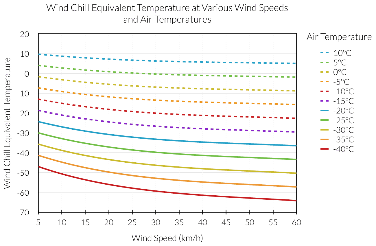
The other thing worth noting is all those weird numbers. Where did 13.12 come from? What’s with 0.6215 and 11.37? I’ve heard of squaring things, but what’s with an exponent of 0.16?
Those are all coefficients that were determined in the linear regression of the series of equations to produce a single equation that requires only wind speed and temperature. To put it in simpler terms, those numbers are assumptions.
A Boatload of Assumptions
In fact, there are a whole host of assumptions that go into simplifying this complex system into a single equation. In total there are 7 key components of calculating wind chill that need to be accounted for which can be broken into two groups: body parameters and environmental parameters. First, the body parameters:
- Height of Face
- Width of Face
- Walking Speed
- Body Thermal Conductance
These are all choices that are made to account for the person the wind is blowing against. Numbers 1 & 2 account for how the wind impacts the face. The face is assumed to be a perfect cylinder of a given diameter whose centre is some height above the ground. The values chosen in the regression are a height of 1.5m above ground and a diameter of 18cm. This does broadly represent a decent average of the populace, but naturally your mileage may vary on how well you fit those values. The walking speed is assumed to be into the wind and is assumed to be 1.3m/s. So if you are standing still or running, the wind chill number produced by that equation is not valid for you.
The last value is the body thermal conductance and is perhaps the most contestable number in the entire thing. To create the wind chill equation a value of 11(frac{W}{m^2K}). This parameter is a measure of how effectively heat is transferred from the body’s core to the surface of the skin; the larger this number is the more heat is lost from the core. Obviously you could make this number very small by wearing some good Arctic issue winter wear, but in reality – as anyone who has been anywhere near a high school in winter has seen – people do not dress that well for cold weather. A lot of research has gone into this number from organizations all over the world and very reasonable acceptable values for it range from 4(frac{W}{m^2K}) all the way up to 100(frac{W}{m^2K}). This accounts for a dramatic range of heat loss.
These four parameters alone can substantially change the computed wind chill value, and there’s still the environmental parameters! The three that fit into that category are:
- Wind Power Exponent
- Wind Speed
- Air Temperature
The wind power exponent a number used to take a wind measurement at 10m off the ground and approximate the wind speed at the height of a person’s face. This number can vary quite a bit based on terrain, vertical stability profiles and other minor factors. The other two – wind speed and air temperature – are fairly self-explanatory.[2]
So now we’ve covered the 7 key parameters in calculating wind chill and some of the assumptions take with each one of them. To summarize each component and the assumed values are:
- Face Height: 1.5m
- Face Width: A cylinder with diameter of 18cm
- Walking Speed: 1.3m/s
- Body Thermal Conductance: 13(frac{W}{m^2K})
- Wind Power Exponent: 0.21
These assumptions can be dangerous simply because not everyone’s face is 1.5m off the ground and we don’t all have perfect cylinder heads. Fortunately, we can account for those things by introducing error into our calculations; we can assume that the acceptable variance in a value is ±X, where X is some number that adequately captures an acceptable range in that parameter value. We can then calculate a simple graph called a probability distribution that depicts what the probability is of the end value being any one specific value (e.g. given all the variance, with these conditions how likely is it that the wind chill is actually -40).
Just A Little Off…
Great! We’ve assessed weaknesses in the assumptions and know that we can compensate for those by including variations on those values into the equations we use to calculate wind chill. Well, it would be great, but absolutely no error or variation is used in creating the wind chill equation. Even documented “guaranteed” error, such as the well-known ±4km/h attached to any wind speed reading from an anemometer has been ignored.
This has huge implications on the calculation of the wind chill. I’m going to skip a lot of small ones to target the big one:
Ignoring error in the calculation of wind chill has created a value that is conveyed as a number we have high confidence in; in reality, wind chill is one of the most uncertain weather parameters there is.
Here are two probability distributions for wind chill. The first one, in dark blue, follows the methodology used to create the wind chill equation and uses the assumed parameters while ignoring all variance. We see a very concise plot of a 100% certainty of a value of -40 for the wind chill. In a lighter blue, we’ve used the same parameter values but with reasonable variances included in the calculation. It’s easy to see that it tells a very different story.
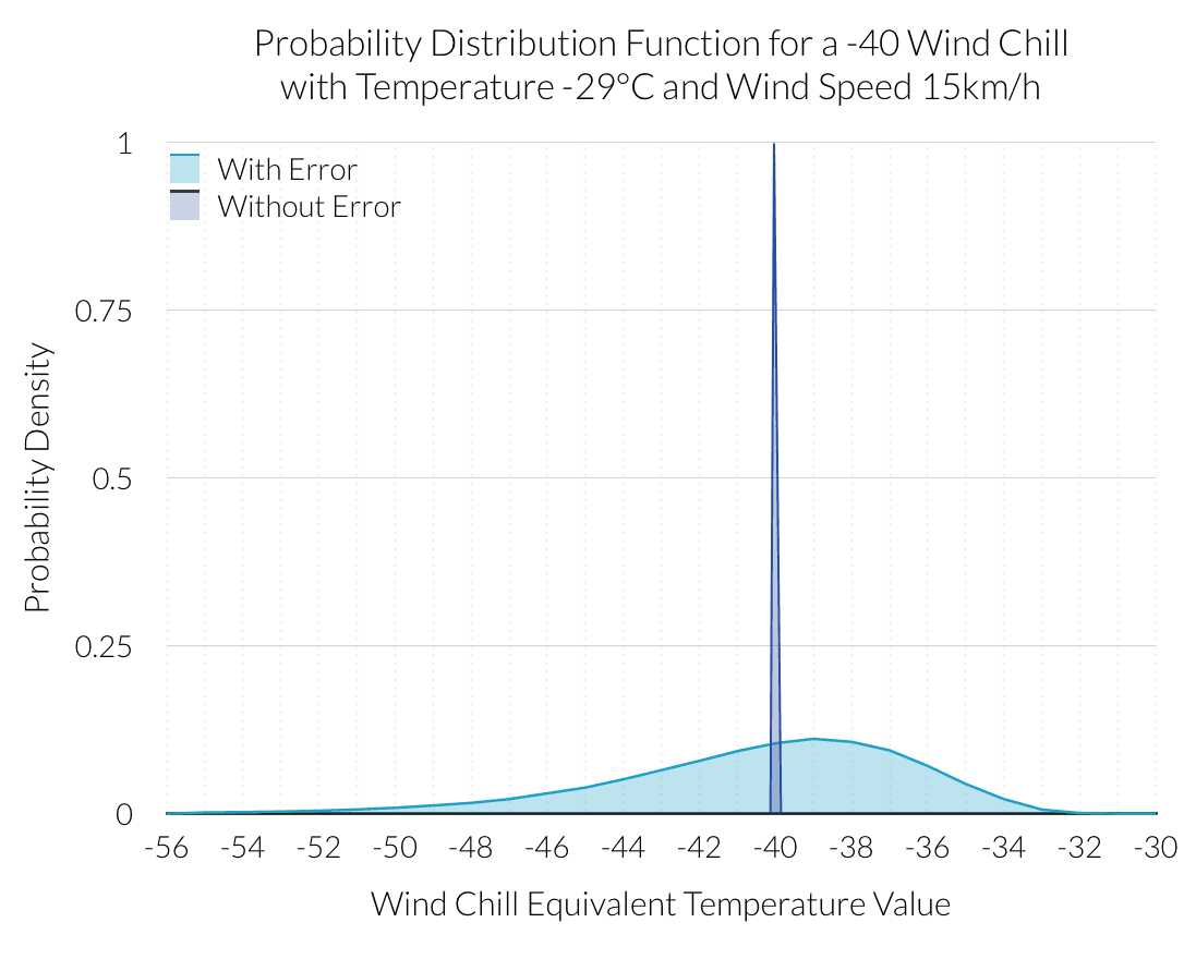
The currently used linear regression for calculating wind chill is grossly over-confident in the actual wind chill value. In addition to that, its spread is very narrow (nothing), while the spread including standard deviation is quite large.
What does this mean in plain english? In reality, when you see that the wind chill is -40, it could actually be anywhere from -30 to -50 depending on a whole lot of small differences in our bodies and/or the environment.
| Parameter | Variance |
|---|---|
| Face Height (m) | 1.5 ± 0.05 |
| Face Width (cm) | 18 ± 0.006 |
| Walking Speed (m/s) | 1.3 ± 0.27 |
| Body Thermal Conductance | 13 ± 4.5 |
| Wind Power Exponent | 0.21 ± 0.06 |
| Wind Speed (km/h) | 15 ± 1.85 |
| Air Temperature (°C) | -29 ± 0.25 |
And this is why wind chill, in its current form, is such a poor parameter to be using. Undoubtedly wind chill is a very real phenomenon that can have a dramatic impact on our bodies. It is, however, a parameter which has huge variation from person to person and depends significantly on how we dress, what our environment is like and on many factors where there will always be some level of uncertainty or variation. While we have gotten used to explicit declarations of the wind chill value, reality is far more fuzzy.
Warn On The Temperature
The significant problems with the calculations of wind chill and some of the curiosities regarding how Environment Canada warns a wind chill event leads us back to the changes being made to the warnings for extreme cold in the winter time.
As I’ve shown above, there are some egregious assumptions made that oversimplify the reality of how wind chill can be measured. In addition to that, there are fundamental parameters that can be dramatically altered by body type and clothing. The idea that there’s a “one size fits all” solution to wind chill simply isn’t rooted in reality.
Because of that, I can only applaud Environment Canada for moving back towards using the temperature to warn for extreme cold. The temperature is nothing but itself and is the baseline for heat loss. We are very good at measuring it and its variability across an area is far smaller than the wind.
This makes temperature a far more favourable parameter to use when talking about extreme cold; it is more representative over an area, has a more uniform affect on our bodies and requires no external assumptions. Hopefully, the next time you hear the “feels like” temperature in the winter time, you’ll now know that number isn’t all it’s cracked up to be.
For further reading on how the cold affects the body, check out this excellent article by Outside Magazine. I’ve attached my references below.
References
- Bluestein, M. and J. Zecher, 1999: A new approach to an accurate wind chill factor. Bull. Amer. Meteor. Soc., 80, 1893-1899.
- Bluestein, M. and R. Osczevski, 2002: Wind chill and the development of frostbite in the face. Preprints, 15th Conf. on Biometeorology and Aerobiology, Kansas City, MO, Amer. Meteor. Soc., 168-171.
- Tikuisis, P. and R. Osczevski 2002: Facial Cooling During Cold Air Exposure. Bull. Amer. Meteor. Soc. July 2003, p. 927–934
- Osczevski, Randall and Maurice Bluestein. The New Wind Chill Equivalent Temperature Chart. Bulletin of the American Meteorological Society, Oct. 2005, p. 1453–1458.
- Osczevki, R. J., 1994: The thermal resistance of the cheek in cold air. Defence and Civil Institute of Environ- mental Medicine Rep., 94–47.
- Stolwijk, J. 1971: A Mathematical Model of Physiological Temperature Regulation in Man. NASA Contractor Report, August 1971


